Chapter 12 Plotting
Whether you are doing EDA, or preparing your results for publication, you need plots. R has many plotting mechanisms, allowing the user a tremendous amount of flexibility, while abstracting away a lot of the tedious details. To be concrete, many of the plots in R are simply impossible to produce with Excel, SPSS, or SAS, and would take a tremendous amount of work to produce with Python, Java and lower level programming languages.
In this text, we will focus on two plotting packages. The basic graphics package, distributed with the base R distribution, and the ggplot2 package.
Before going into the details of the plotting packages, we start with some philosophy. The graphics package originates from the mainframe days. Computers had no graphical interface, and the output of the plot was immediately sent to a printer. Once a plot has been produced with the graphics package, just like a printed output, it cannot be queried nor changed, except for further additions.
The philosophy of R is that everyting is an object. The graphics package does not adhere to this philosophy, and indeed it was soon augmented with the grid package (R Core Team 2016), that treats plots as objects. grid is a low level graphics interface, and users may be more familiar with the lattice package built upon it (Sarkar 2008).
lattice is very powerful, but soon enough, it was overtaken in popularity by the ggplot2 package (Wickham 2009). ggplot2 was the PhD project of Hadley Wickham, a name to remember… Two fundamental ideas underlay ggplot2: (i) everything is an object, and (ii), plots can be described by a simple grammar, i.e., a language to describe the building blocks of the plot. The grammar in ggplot2 are is the one stated by Wilkinson (2006). The objects and grammar of ggplot2 have later evolved to allow more complicated plotting and in particular, interactive plotting.
Interactive plotting is a very important feature for EDA, and reporting. The major leap in interactive plotting was made possible by the advancement of web technologies, such as JavaScript and D3.JS. Why is this? Because an interactive plot, or report, can be seen as a web-site. Building upon the capabilities of JavaScript and your web browser to provide the interactivity, greatly facilitates the development of such plots, as the programmer can rely on the web-browsers capabilities for interactivity.
12.1 The graphics System
The R code from the Basics Chapter 3 is a demonstration of the graphics package and plotting system. We make a quick review of the basics.
12.1.1 Using Existing Plotting Functions
12.1.1.1 Scatter Plot
A simple scatter plot.
attach(trees)
plot(Girth ~ Height)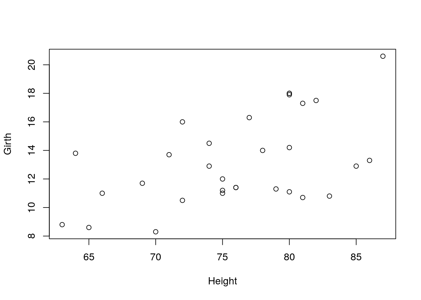
Various types of plots.
par.old <- par(no.readonly = TRUE)
par(mfrow=c(2,3))
plot(Girth, type='h', main="type='h'")
plot(Girth, type='o', main="type='o'")
plot(Girth, type='l', main="type='l'")
plot(Girth, type='s', main="type='s'")
plot(Girth, type='b', main="type='b'")
plot(Girth, type='p', main="type='p'")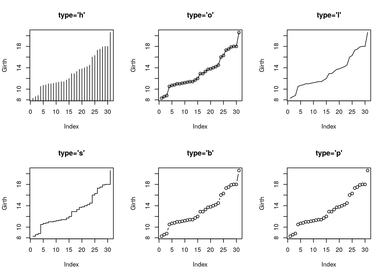
par(par.old)Things to note:
- The
parcommand controls the plotting parameters.mfrow=c(2,3)is used to produce a matrix of plots with 2 rows and 3 columns. - The
par.oldobject saves the original plotting setting. It is restored after plotting usingpar(par.old). - The
typeargument controls the type of plot. - The
mainargument controls the title. - See
?plotand?parfor more options.
Control the plotting characters with the pch argument, and size with the cex argument.
plot(Girth, pch='+', cex=3)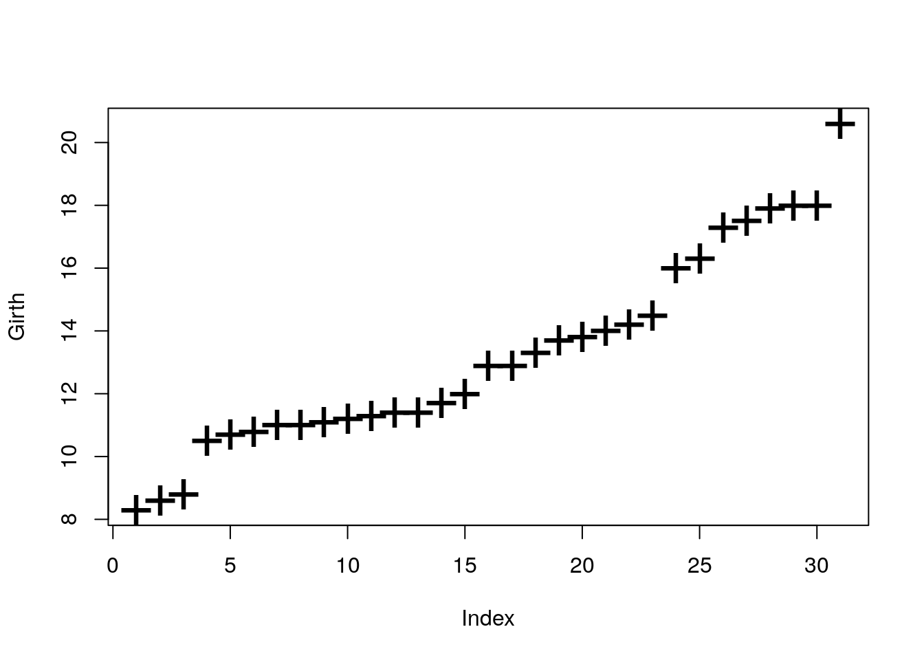
Control the line’s type with lty argument, and width with lwd.
par(mfrow=c(2,3))
plot(Girth, type='l', lty=1, lwd=2)
plot(Girth, type='l', lty=2, lwd=2)
plot(Girth, type='l', lty=3, lwd=2)
plot(Girth, type='l', lty=4, lwd=2)
plot(Girth, type='l', lty=5, lwd=2)
plot(Girth, type='l', lty=6, lwd=2)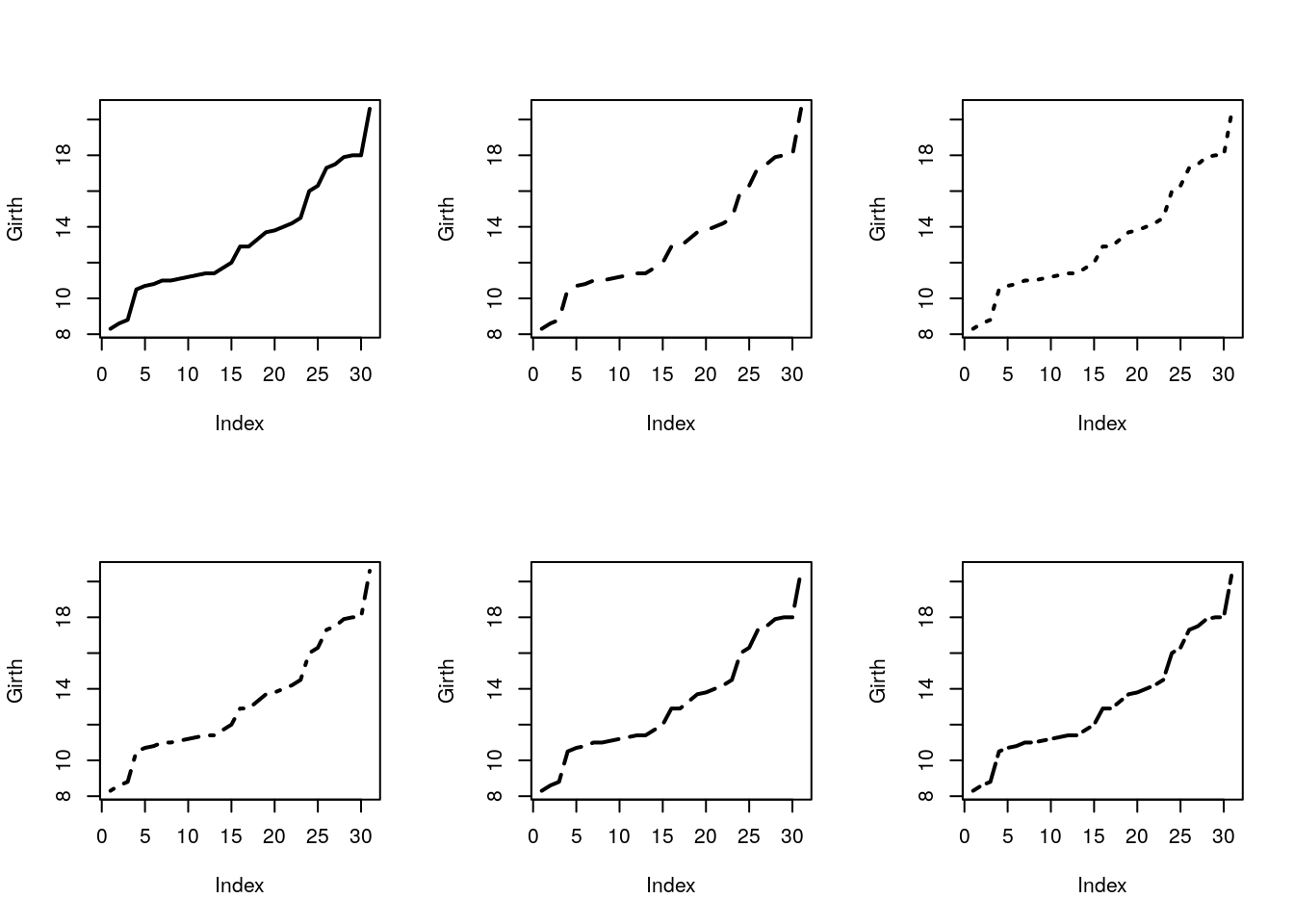
Add line by slope and intercept with abline.
plot(Girth)
abline(v=14, col='red') # vertical line at 14.
abline(h=9, lty=4,lwd=4, col='pink') # horizontal line at 9.
abline(a = 0, b=1) # linear line with intercept a=0, and slope b=1.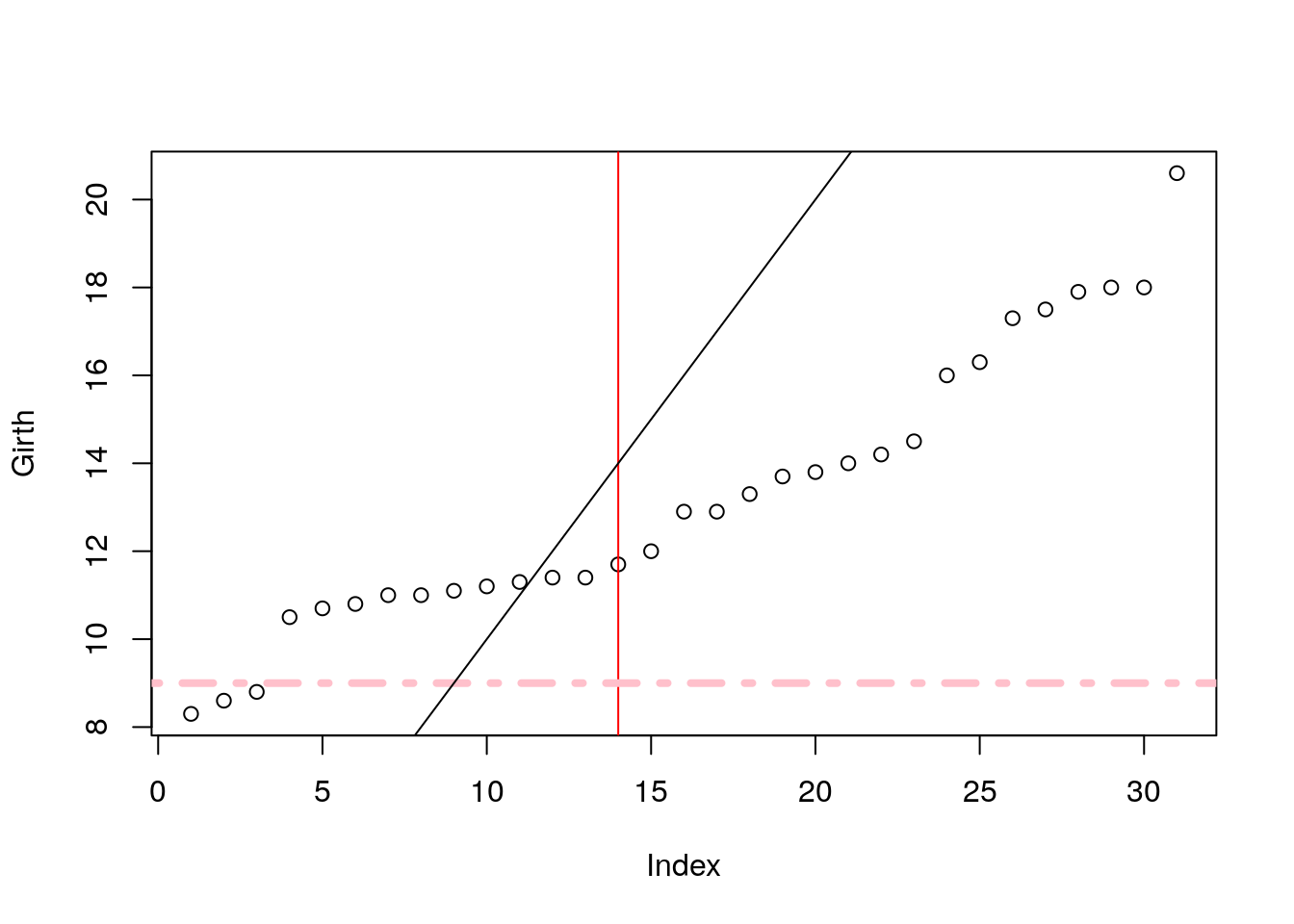
plot(Girth)
points(x=1:30, y=rep(12,30), cex=0.5, col='darkblue')
lines(x=rep(c(5,10), 7), y=7:20, lty=2 )
lines(x=rep(c(5,10), 7)+2, y=7:20, lty=2 )
lines(x=rep(c(5,10), 7)+4, y=7:20, lty=2 , col='darkgreen')
lines(x=rep(c(5,10), 7)+6, y=7:20, lty=4 , col='brown', lwd=4)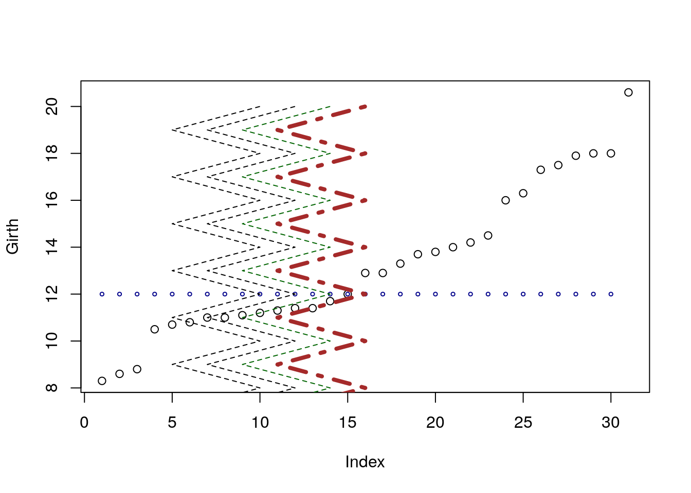
Things to note:
pointsadds points on an existing plot.linesadds lines on an existing plot.colcontrols the color of the element. It takes names or numbers as argument.cexcontrols the scale of the element. Defaults tocex=1.
Add other elements.
plot(Girth)
segments(x0=rep(c(5,10), 7), y0=7:20, x1=rep(c(5,10), 7)+2, y1=(7:20)+2 ) # line segments
arrows(x0=13,y0=16,x1=16,y1=17) # arrows
rect(xleft=10, ybottom=12,  xright=12, ytop=16) # rectangle
polygon(x=c(10,11,12,11.5,10.5), y=c(9,9.5,10,10.5,9.8), col='grey') # polygon
title(main='This plot makes no sense', sub='Or does it?')
mtext('Printing in the margins', side=2) # math text
mtext(expression(alpha==log(f[i])), side=4)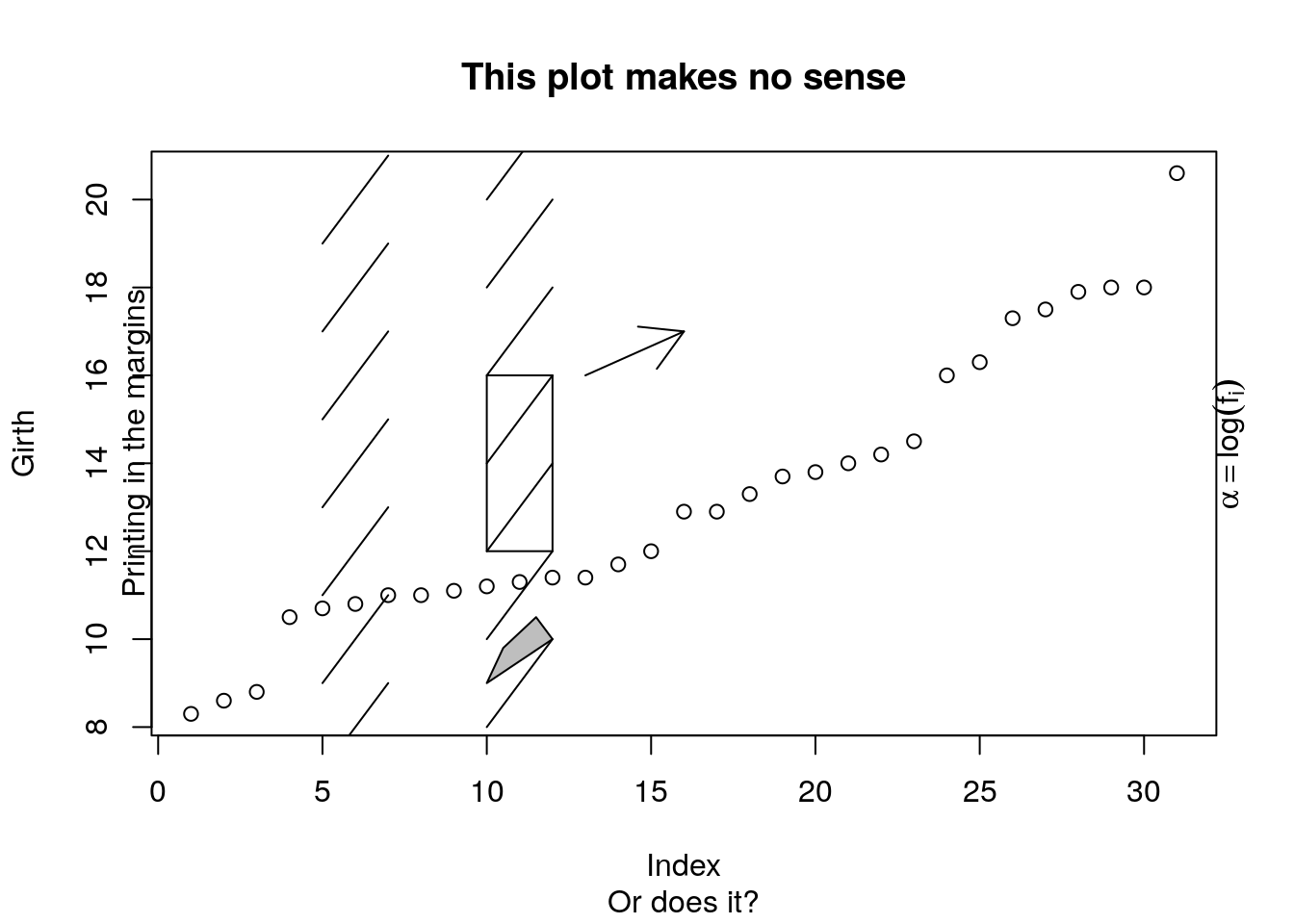
Things to note:
- The following functions add the elements they are named after:
segments,arrows,rect,polygon,title. mtextadds mathematical text, which needs to be wrapped inexpression(). For more information for mathematical annotation see?plotmath.
Add a legend.
plot(Girth, pch='G',ylim=c(8,77), xlab='Tree number', ylab='', type='b', col='blue')
points(Volume, pch='V', type='b', col='red')
legend(x=2, y=70, legend=c('Girth', 'Volume'), pch=c('G','V'), col=c('blue','red'), bg='grey')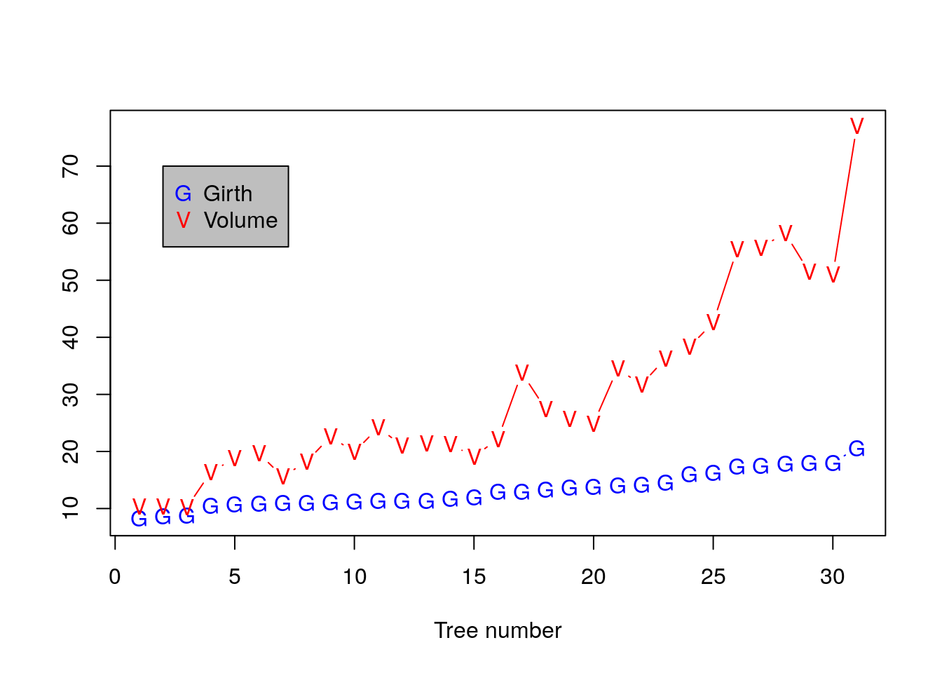
Adjusting Axes with xlim and ylim.
plot(Girth, xlim=c(0,15), ylim=c(8,12))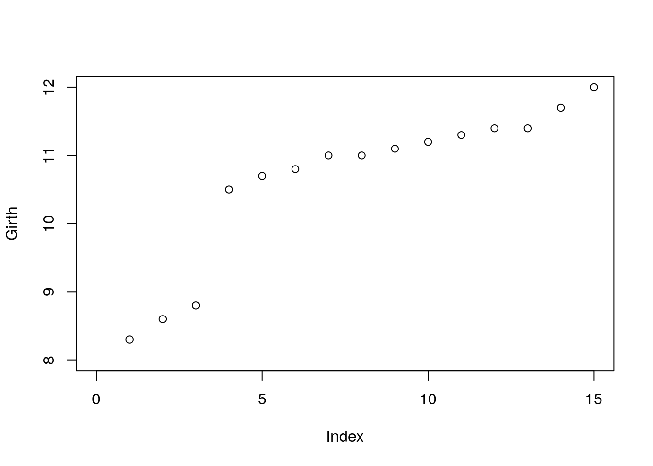
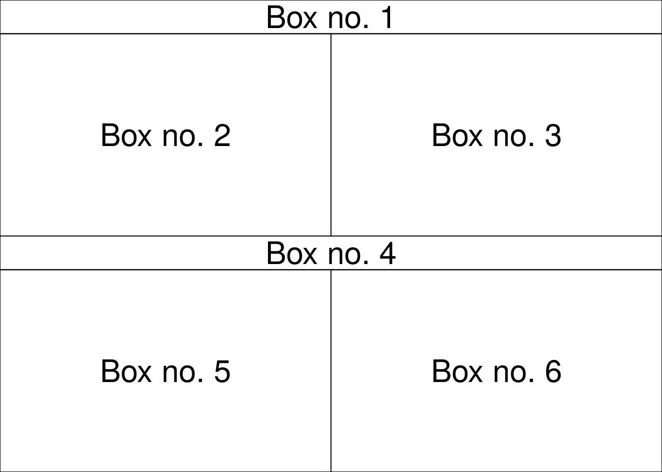
Use layout for complicated plot layouts.
A<-matrix(c(1,1,2,3,4,4,5,6), byrow=TRUE, ncol=2)
layout(A,heights=c(1/14,6/14,1/14,6/14))

oma.saved <- par("oma")
par(oma = rep.int(0, 4))
par(oma = oma.saved)
o.par <- par(mar = rep.int(0, 4))
for (i in seq_len(6)) {
    plot.new()
    box()
    text(0.5, 0.5, paste('Box no.',i), cex=3)
}
Always detach.
detach(trees)12.1.2 Exporting a Plot
The pipeline for exporting graphics is similar to the export of data.
Instead of the write.table or save functions, we will use the pdf, tiff, png, functions. Depending on the type of desired output.
Check and set the working directory.
getwd()
setwd("/tmp/")
Export tiff.
tiff(filename='graphicExample.tiff')
plot(rnorm(100))
dev.off()
Things to note:
- The
tifffunction tells R to open a .tiff file, and write the output of a plot. - Only a single (the last) plot is saved.
dev.offto close the tiff device, and return the plotting to the R console (or RStudio).
If you want to produce several plots, you can use a counter in the file’s name. The counter uses the printf format string.
tiff(filename='graphicExample%d.tiff') #Creates a sequence of files
plot(rnorm(100))
boxplot(rnorm(100))
hist(rnorm(100))
dev.off()
To see the list of all open devices use dev.list().
To close all device, (not only the last one), use graphics.off().
See ?pdf and ?jpeg for more info.
12.1.3 Fancy graphics Examples
12.1.3.1 Line Graph
x = 1995:2005
y = c(81.1, 83.1, 84.3, 85.2, 85.4, 86.5, 88.3, 88.6, 90.8, 91.1, 91.3)
plot.new()
plot.window(xlim = range(x), ylim = range(y))
abline(h = -4:4, v = -4:4, col = "lightgrey")
lines(x, y, lwd = 2)
title(main = "A Line Graph Example",
        xlab = "Time",
        ylab = "Quality of R Graphics")
axis(1)
axis(2)
box()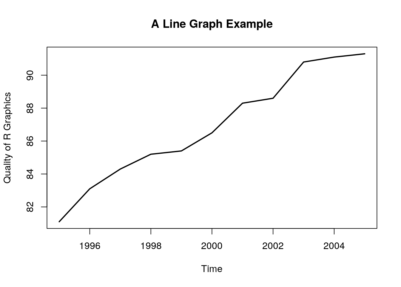
Things to note:
plot.newcreates a new, empty, plotting device.plot.windowdetermines the limits of the plotting region.axisadds the axes, andboxthe framing box.- The rest of the elements, you already know.
12.1.3.2 Rosette
n = 17
theta = seq(0, 2 * pi, length = n + 1)[1:n]
x = sin(theta)
y = cos(theta)
v1 = rep(1:n, n)
v2 = rep(1:n, rep(n, n))
plot.new()
plot.window(xlim = c(-1, 1), ylim = c(-1, 1), asp = 1)
segments(x[v1], y[v1], x[v2], y[v2])
box()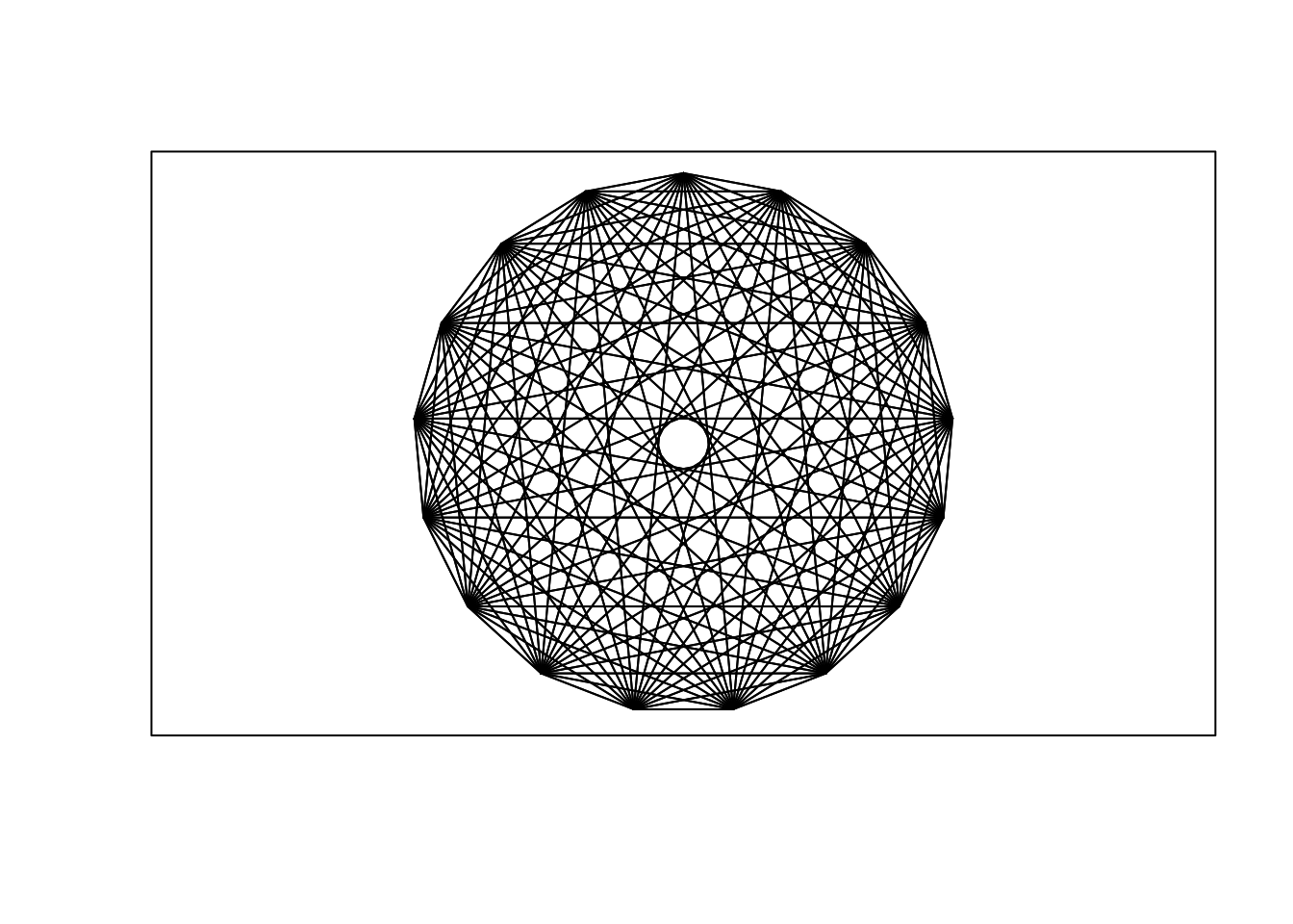
12.1.3.3 Arrows
plot.new()
plot.window(xlim = c(0, 1), ylim = c(0, 1))
arrows(.05, .075, .45, .9, code = 1)
arrows(.55, .9, .95, .075, code = 2)
arrows(.1, 0, .9, 0, code = 3)
text(.5, 1, "A", cex = 1.5)
text(0, 0, "B", cex = 1.5)
text(1, 0, "C", cex = 1.5)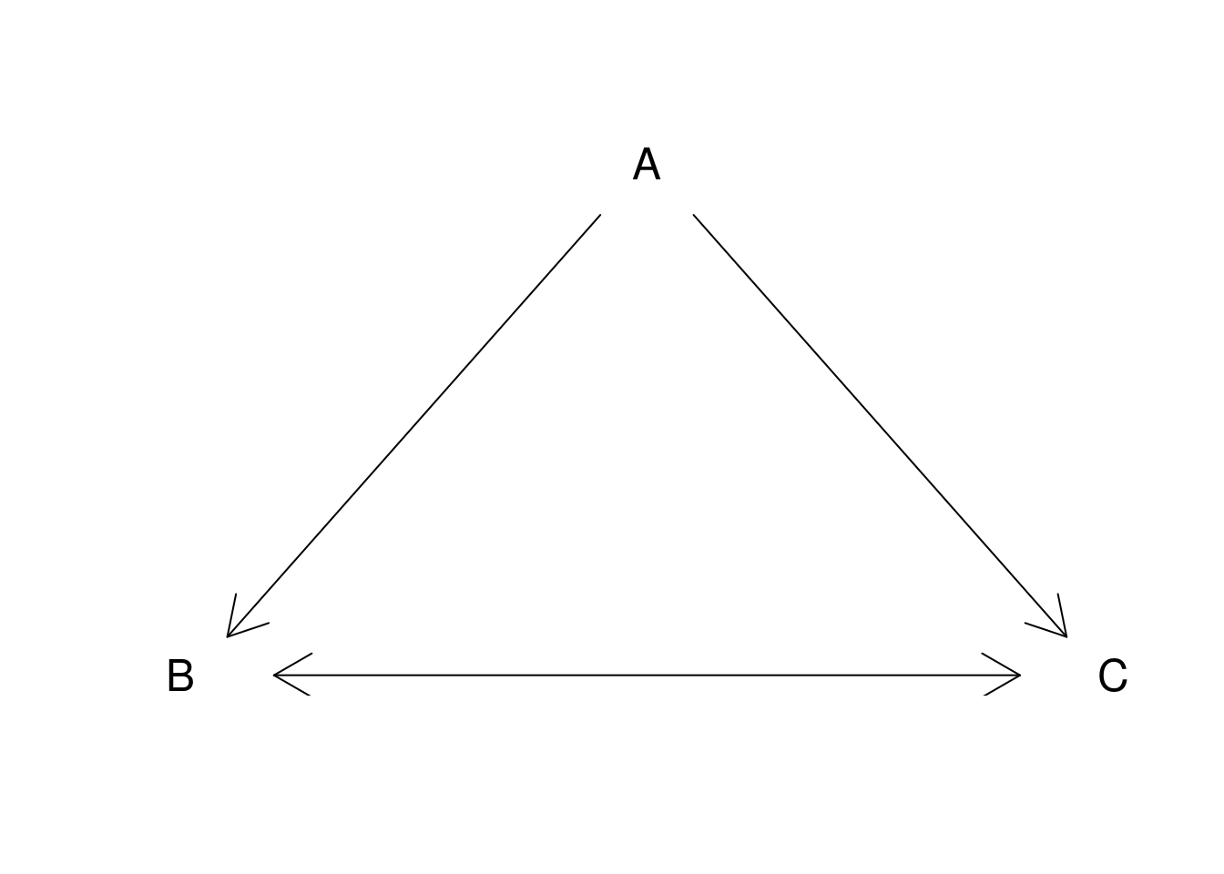
12.1.3.4 Arrows as error bars
x = 1:10
y = runif(10) + rep(c(5, 6.5), c(5, 5))
yl = y - 0.25 - runif(10)/3
yu = y + 0.25 + runif(10)/3
plot.new()
plot.window(xlim = c(0.5, 10.5), ylim = range(yl, yu))
arrows(x, yl, x, yu, code = 3, angle = 90, length = .125)
points(x, y, pch = 19, cex = 1.5)
axis(1, at = 1:10, labels = LETTERS[1:10])
axis(2, las = 1)
box()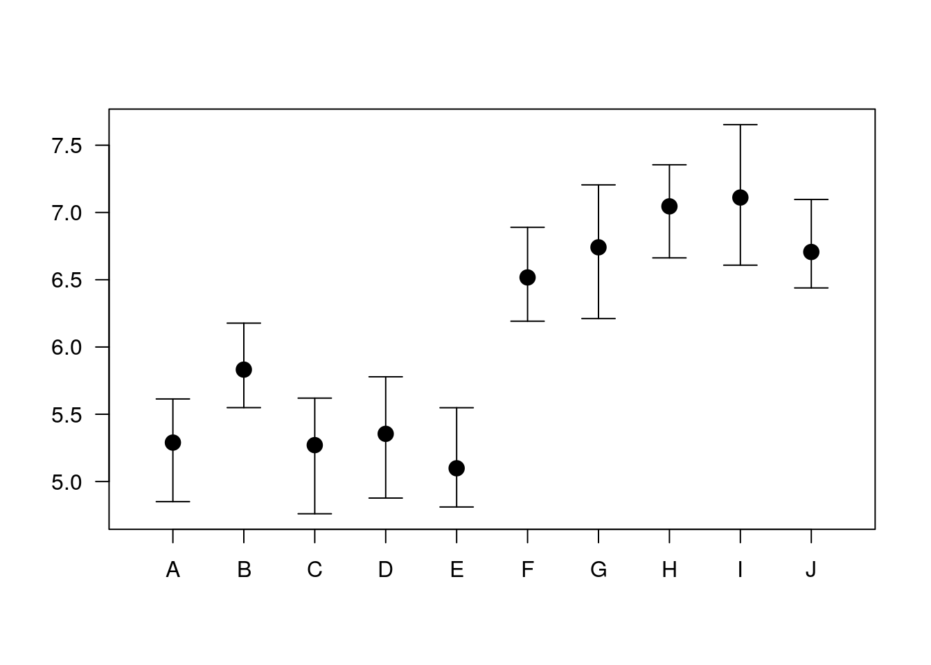
12.1.3.5 Histogram
A histogram is nothing but a bunch of rectangle elements.
plot.new()
plot.window(xlim = c(0, 5), ylim = c(0, 10))
rect(0:4, 0, 1:5, c(7, 8, 4, 3), col = "lightblue")
axis(1)
axis(2, las = 1)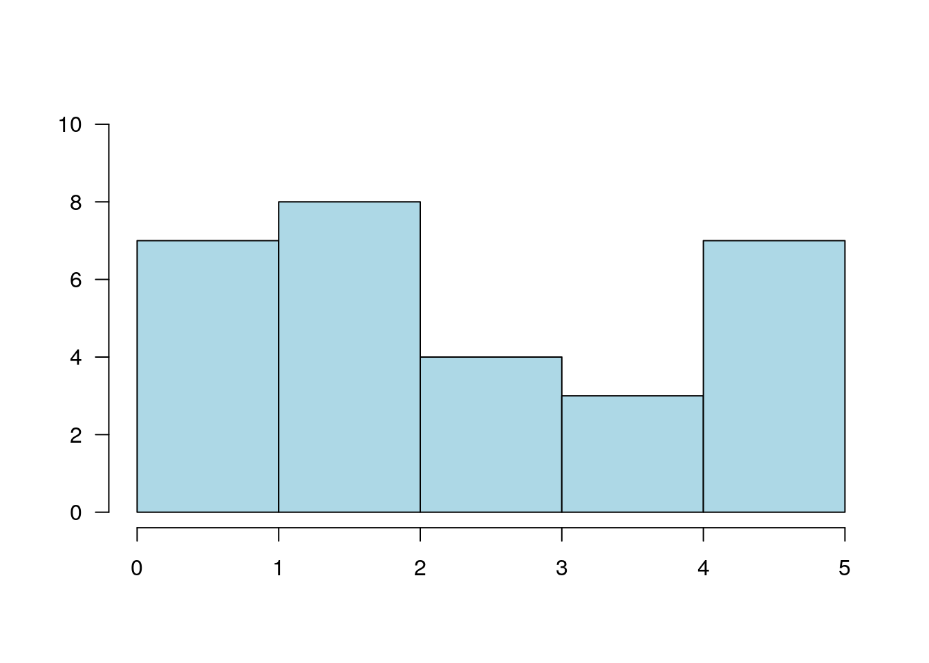
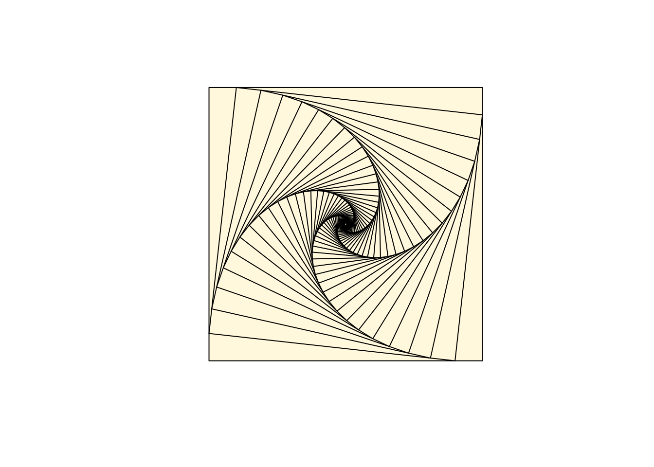
12.1.3.5.1 Spiral Squares
plot.new()
plot.window(xlim = c(-1, 1), ylim = c(-1, 1), asp = 1)
x = c(-1, 1, 1, -1)
y = c( 1, 1, -1, -1)
polygon(x, y, col = "cornsilk")
vertex1 = c(1, 2, 3, 4)
vertex2 = c(2, 3, 4, 1)
for(i in 1:50) {
    x = 0.9 * x[vertex1] + 0.1 * x[vertex2]
    y = 0.9 * y[vertex1] + 0.1 * y[vertex2]
    polygon(x, y, col = "cornsilk")
}
12.1.3.6 Circles
Circles are just dense polygons.
R = 1
xc = 0
yc = 0
n = 72
t = seq(0, 2 * pi, length = n)[1:(n-1)]
x = xc + R * cos(t)
y = yc + R * sin(t)
plot.new()
plot.window(xlim = range(x), ylim = range(y), asp = 1)
polygon(x, y, col = "lightblue", border = "navyblue")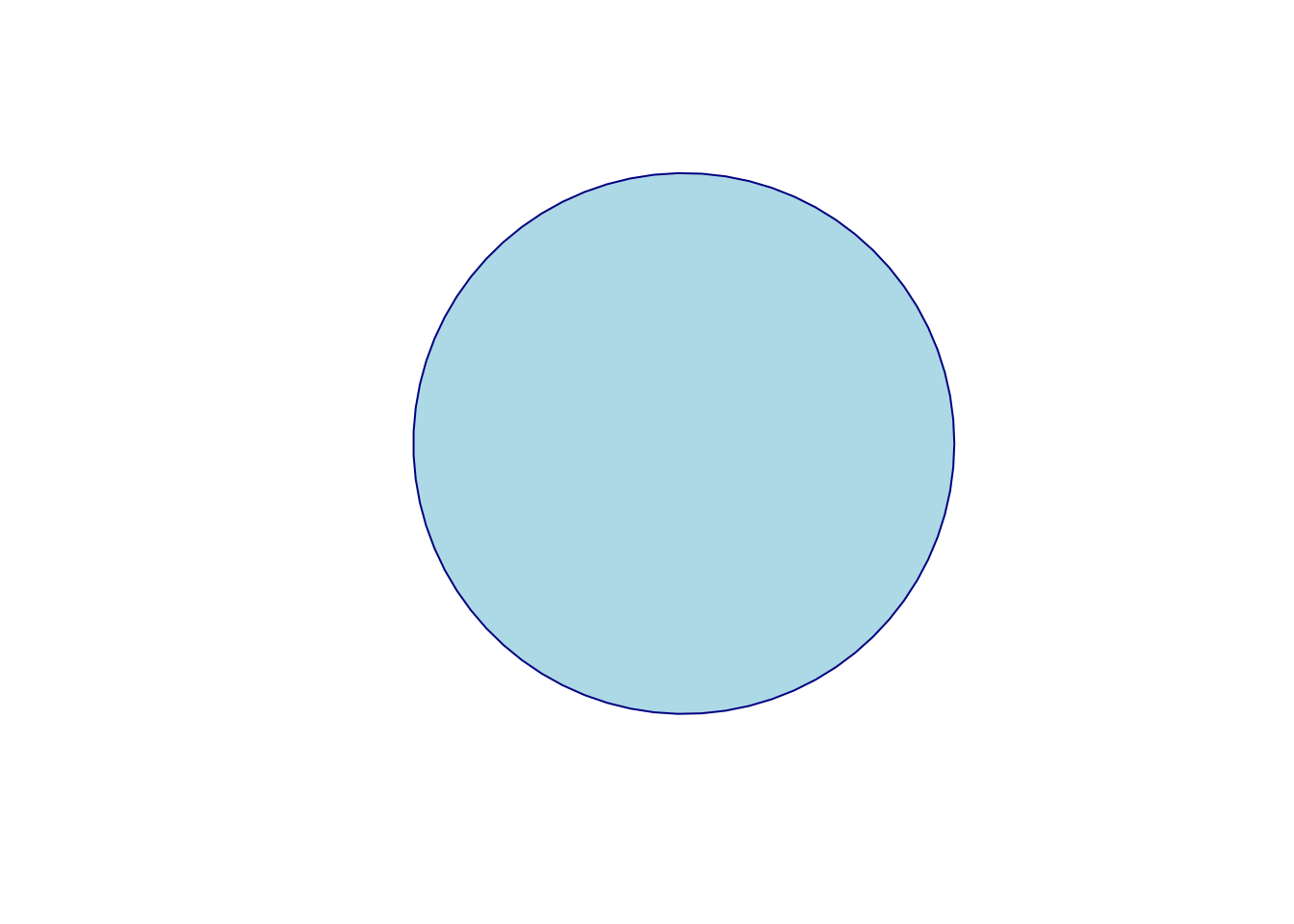
12.1.3.7 Spiral
k = 5
n = k * 72
theta = seq(0, k * 2 * pi, length = n)
R = .98^(1:n - 1)
x = R * cos(theta)
y = R * sin(theta)
plot.new()
plot.window(xlim = range(x), ylim = range(y), asp = 1)
lines(x, y)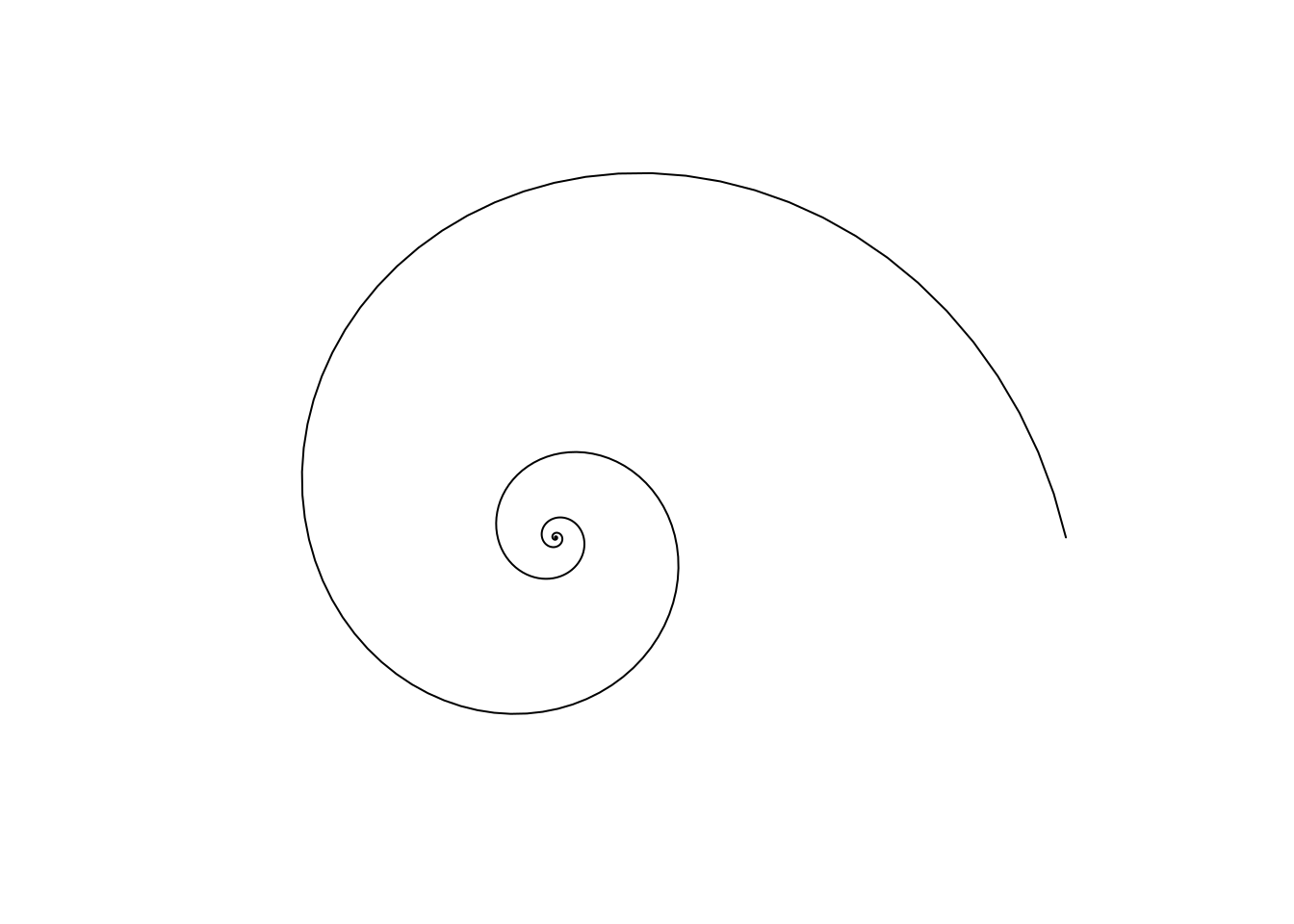
12.2 The ggplot2 System
The philosophy of ggplot2 is very different from the graphics device. Recall, in ggplot2, a plot is a object. It can be queried, it can be changed, and among other things, it can be plotted.
ggplot2 provides a convenience function for many plots: qplot.
We take a non-typical approach by ignoring qplot, and presenting the fundamental building blocks.
Once the building blocks have been understood, mastering qplot will be easy.
The following is taken from UCLA’s idre.
A ggplot2 object will have the following elements:
- Data the data frame holding the data to be plotted.
- Aes defines the mapping between variables to their visualization.
- Geoms are the objects/shapes you add as layers to your graph.
- Stats are statistical transformations when you are not plotting the raw data, such as the mean or confidence intervals.
- Faceting splits the data into subsets to create multiple variations of the same graph (paneling).
The nlme::Milk dataset has the protein level of various cows, at various times, with various diets.
library(nlme)
data(Milk)
head(Milk)
## Grouped Data: protein ~ Time | Cow
## protein Time Cow Diet
## 1 3.63 1 B01 barley
## 2 3.57 2 B01 barley
## 3 3.47 3 B01 barley
## 4 3.65 4 B01 barley
## 5 3.89 5 B01 barley
## 6 3.73 6 B01 barleylibrary(ggplot2)
ggplot(data = Milk, aes(x=Time, y=protein)) +
geom_point()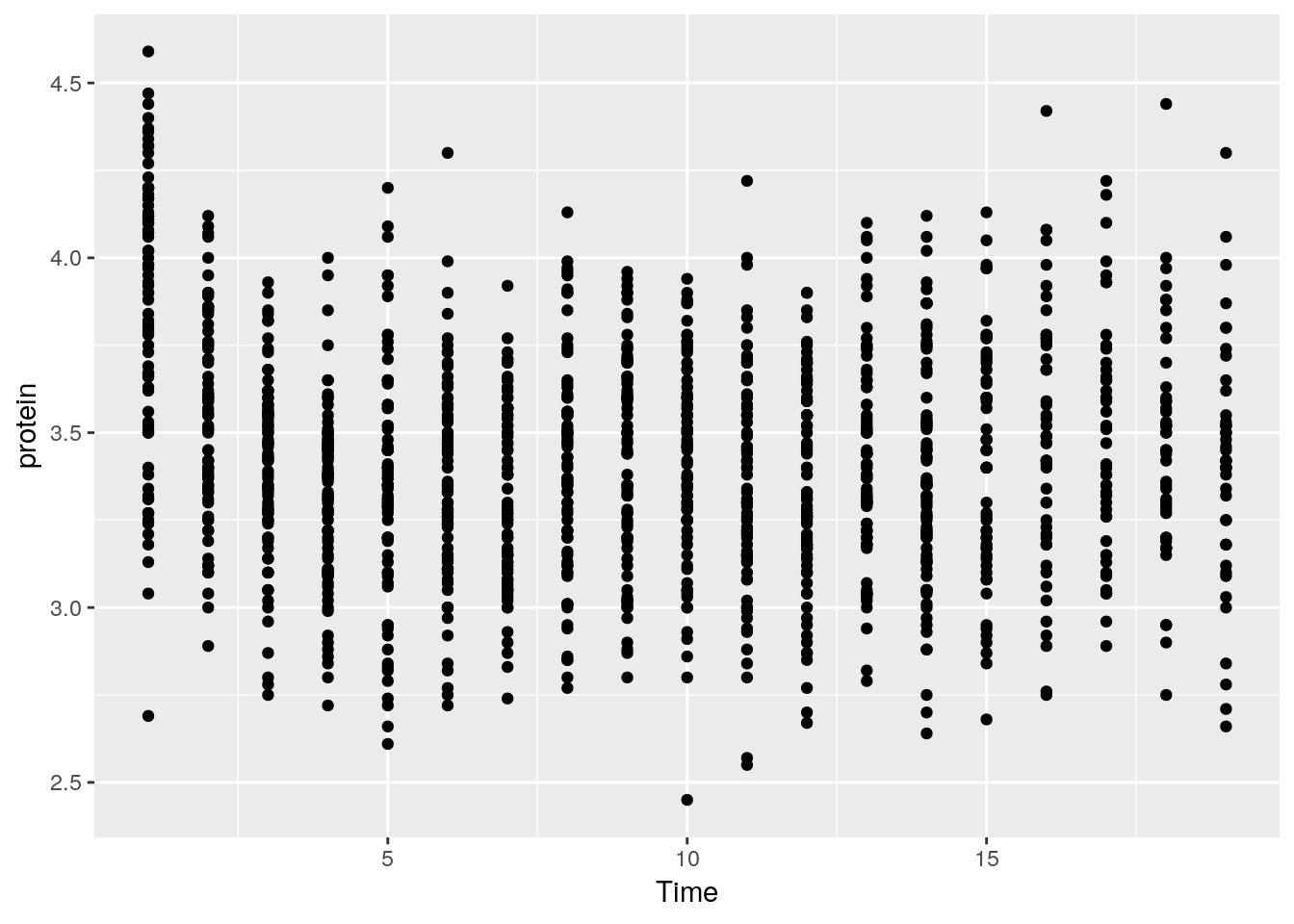
Things to note:
- The
ggplotfunction is the constructor of the ggplot2 object. If the object is not assigned, it is plotted. - The
aesargument tells R that theTimevariable in theMilkdata is the x axis, and protein is y. - The
geom_pointdefines the Geom, i.e., it tells R to plot the points as they are (and not lines, histograms, etc.). - The ggplot2 object is build by compounding its various elements separated by the
+operator. - All the variables that we will need are assumed to be in the
Milkdata frame. This means that (a) the data needs to be a data frame (not a matrix for instance), and (b) we will not be able to use variables that are not in theMilkdata frame.
Let’s add some color.
ggplot(data = Milk, aes(x=Time, y=protein)) +
  geom_point(aes(color=Diet))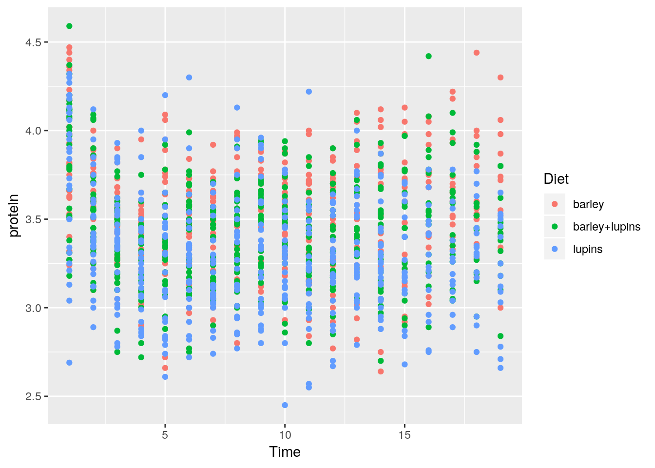
The color argument tells R to use the variable Diet as the coloring.
A legend is added by default.
If we wanted a fixed color, and not a variable dependent color, color would have been put outside the aes function.
ggplot(data = Milk, aes(x=Time, y=protein)) +
  geom_point(color="green")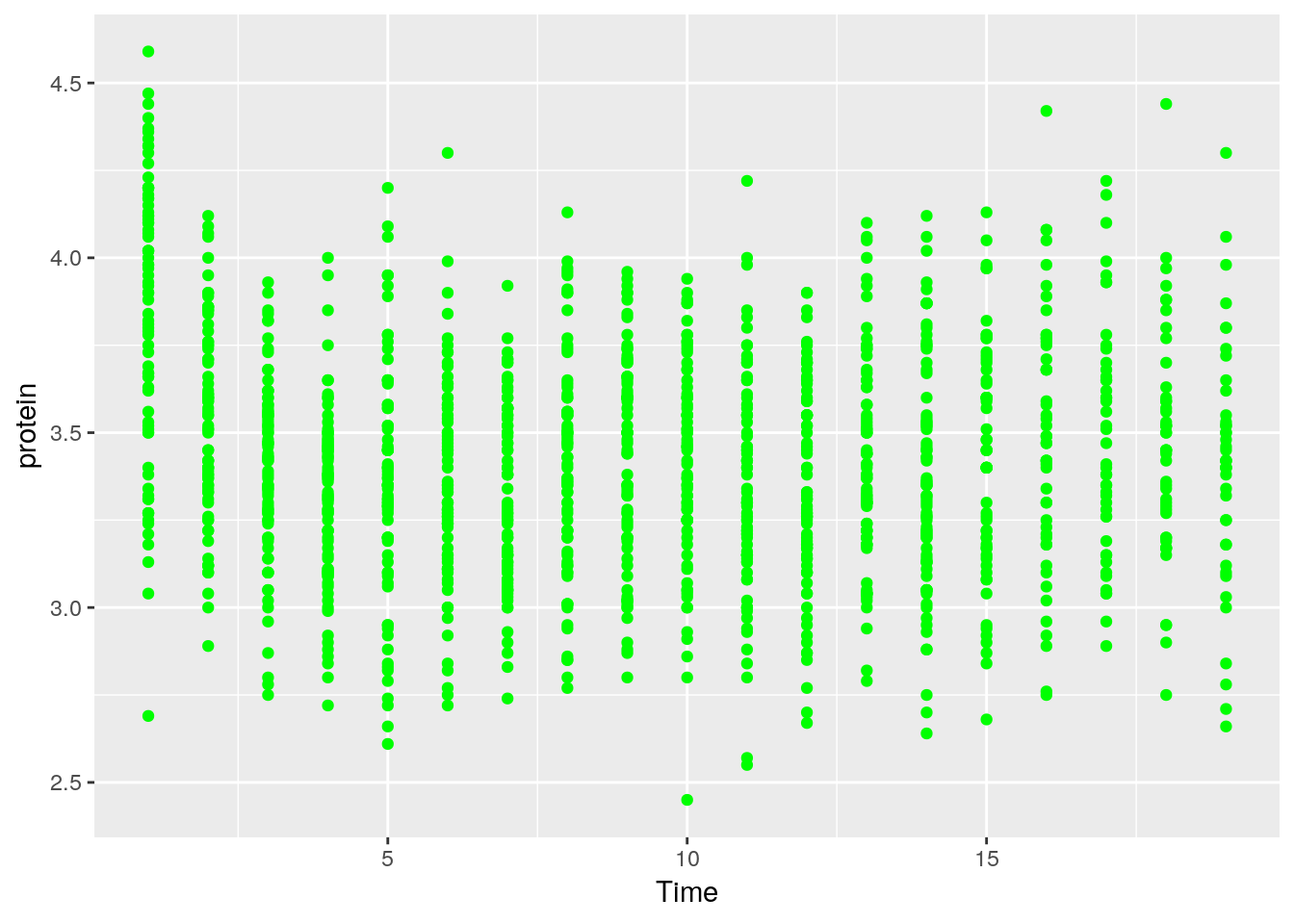
Let’s save the ggplot2 object so we can reuse it. Notice it is not plotted.
p <- ggplot(data = Milk, aes(x=Time, y=protein)) +
  geom_point()
We can change^{In the Object-Oriented Programming lingo, this is known as mutating} existing plots using the + operator.
Here, we add a smoothing line to the plot p.
p + geom_smooth(method = 'gam')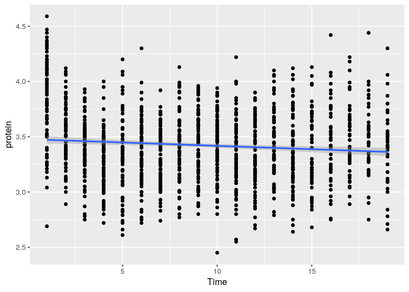
Things to note:
- The smoothing line is a layer added with the
geom_smooth()function. - Lacking arguments of its own, the new layer will inherit the
aesof the original object, x and y variables in particular.
To split the plot along some variable, we use faceting, done with the facet_wrap function.
p + facet_wrap(~Diet)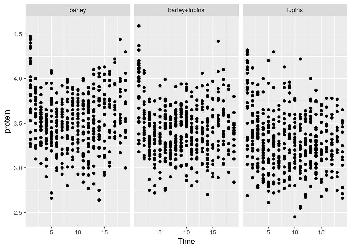
Instead of faceting, we can add a layer of the mean of each Diet subgroup, connected by lines.
p + stat_summary(aes(color=Diet), fun.y="mean", geom="line")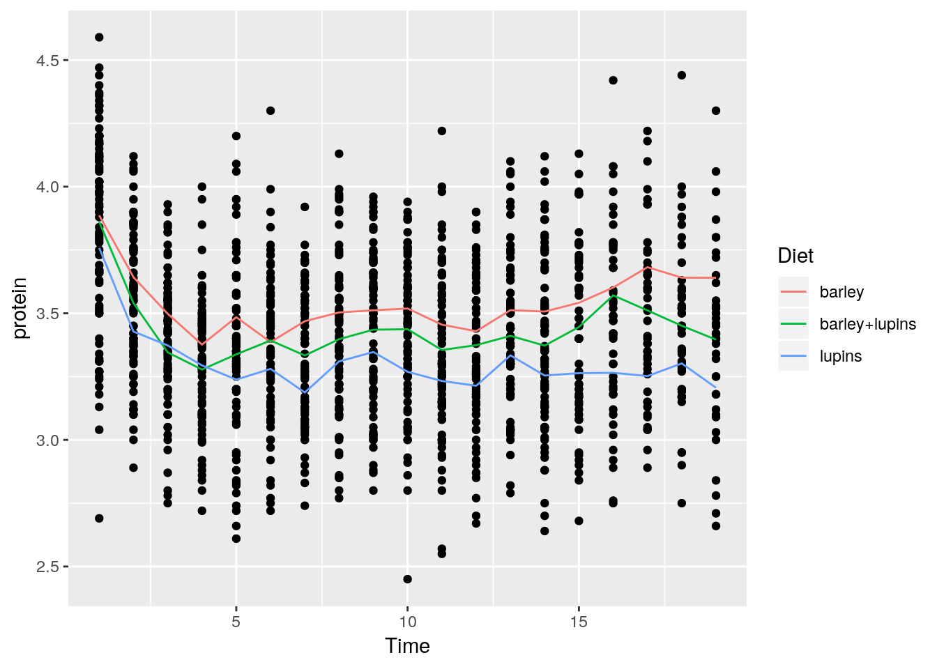
Things to note:
stat_summaryadds a statistical summary.- The summary is applied along
Dietsubgroups, because of thecolor=Dietaesthetic, which has already split the data. - The summary to be applied is the mean, because of
fun.y="mean". - The group means are connected by lines, because of the
geom="line"argument.
What layers can be added using the geoms family of functions?
geom_bar: bars with bases on the x-axis.geom_boxplot: boxes-and-whiskers.geom_errorbar: T-shaped error bars.geom_histogram: histogram.geom_line: lines.geom_point: points (scatterplot).geom_ribbon: bands spanning y-values across a range of x-values.geom_smooth: smoothed conditional means (e.g. loess smooth).
To demonstrate the layers added with the geoms_* functions, we start with a histogram.
pro <- ggplot(Milk, aes(x=protein))
pro + geom_histogram(bins=30)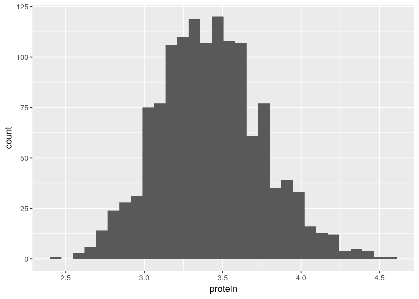
A bar plot.
ggplot(Milk, aes(x=Diet)) +
  geom_bar()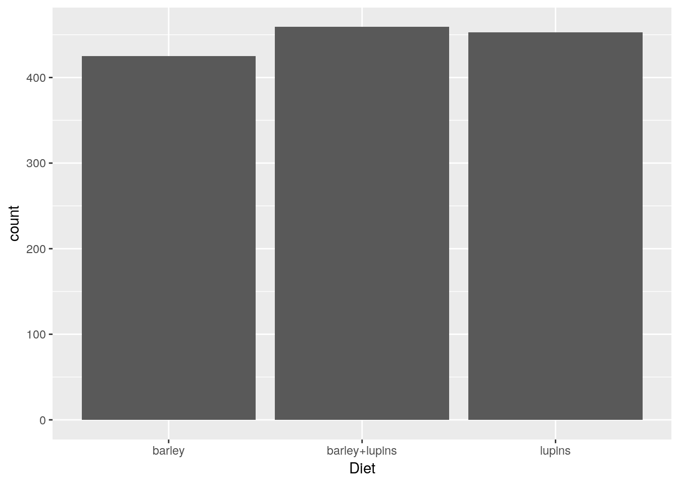
A scatter plot.
tp <- ggplot(Milk, aes(x=Time, y=protein))
tp + geom_point()
A smooth regression plot, reusing the tp object.
tp + geom_smooth(method='gam')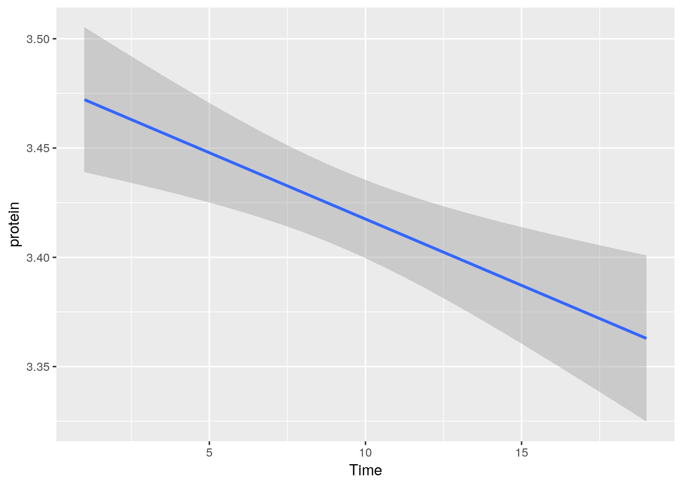
And now, a simple line plot, reusing the tp object, and connecting lines along Cow.
tp + geom_line(aes(group=Cow))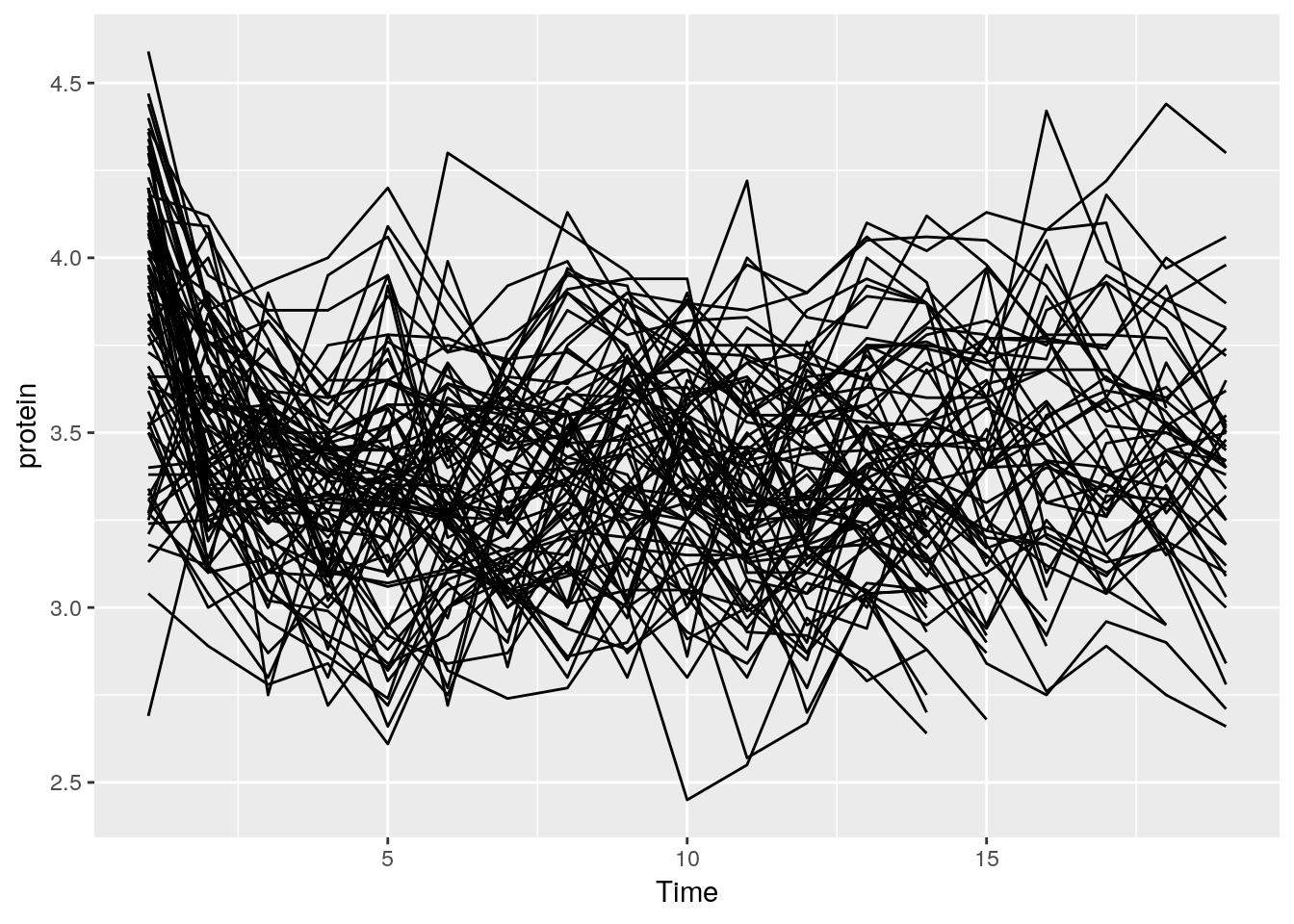
The line plot is completely incomprehensible.
Better look at boxplots along time (even if omitting the Cow information).
tp + geom_boxplot(aes(group=Time))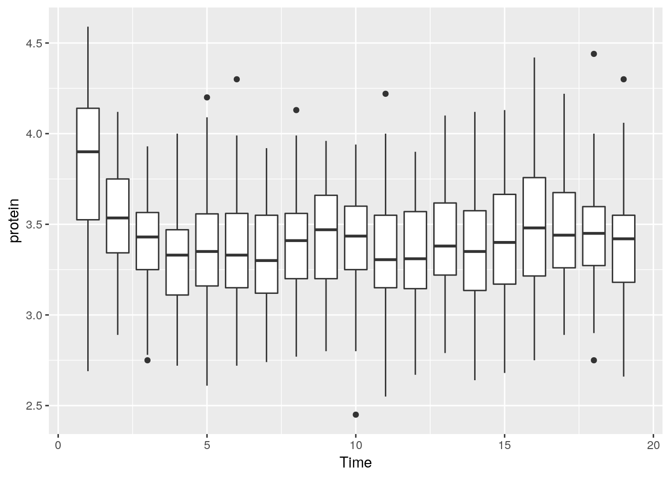
We can do some statistics for each subgroup.
The following will compute the mean and standard errors of protein at each time point.
ggplot(Milk, aes(x=Time, y=protein)) +
  stat_summary(fun.data = 'mean_se')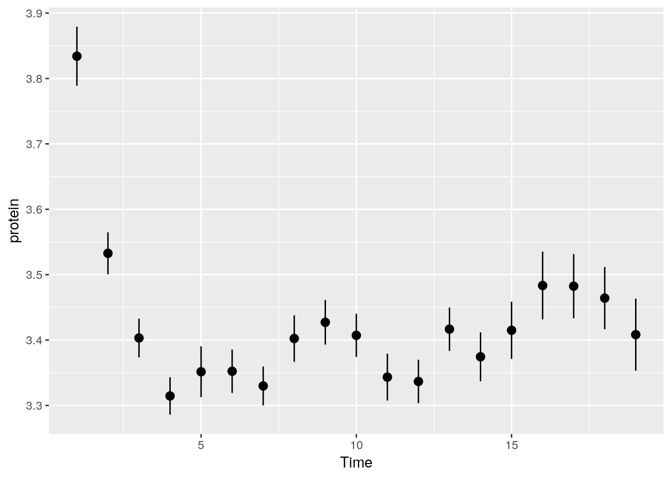
Some popular statistical summaries, have gained their own functions:
mean_cl_boot: mean and bootstrapped confidence interval (default 95%).mean_cl_normal: mean and Gaussian (t-distribution based) confidence interval (default 95%).mean_dsl: mean plus or minus standard deviation times some constant (default constant=2).median_hilow: median and outer quantiles (default outer quantiles = 0.025 and 0.975).
For less popular statistical summaries, we may specify the statistical function in stat_summary. The median is a first example.
ggplot(Milk, aes(x=Time, y=protein)) +
  stat_summary(fun.y="median", geom="point")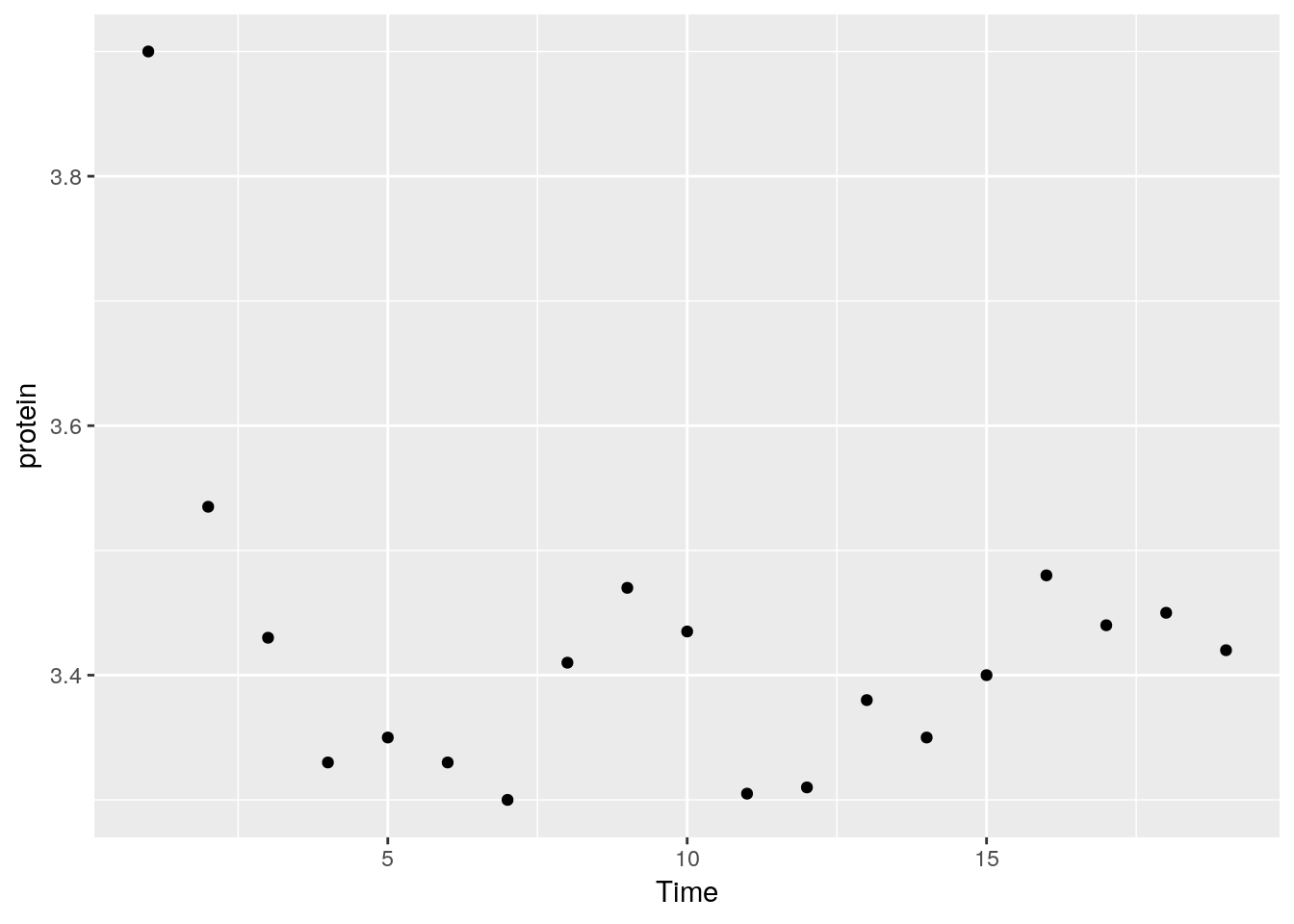
We can also define our own statistical summaries.
medianlog <- function(y) {median(log(y))}
ggplot(Milk, aes(x=Time, y=protein)) +
  stat_summary(fun.y="medianlog", geom="line")
Faceting allows to split the plotting along some variable.
face_wrap tells R to compute the number of columns and rows of plots automatically.
ggplot(Milk, aes(x=protein, color=Diet)) +
  geom_density() +
  facet_wrap(~Time)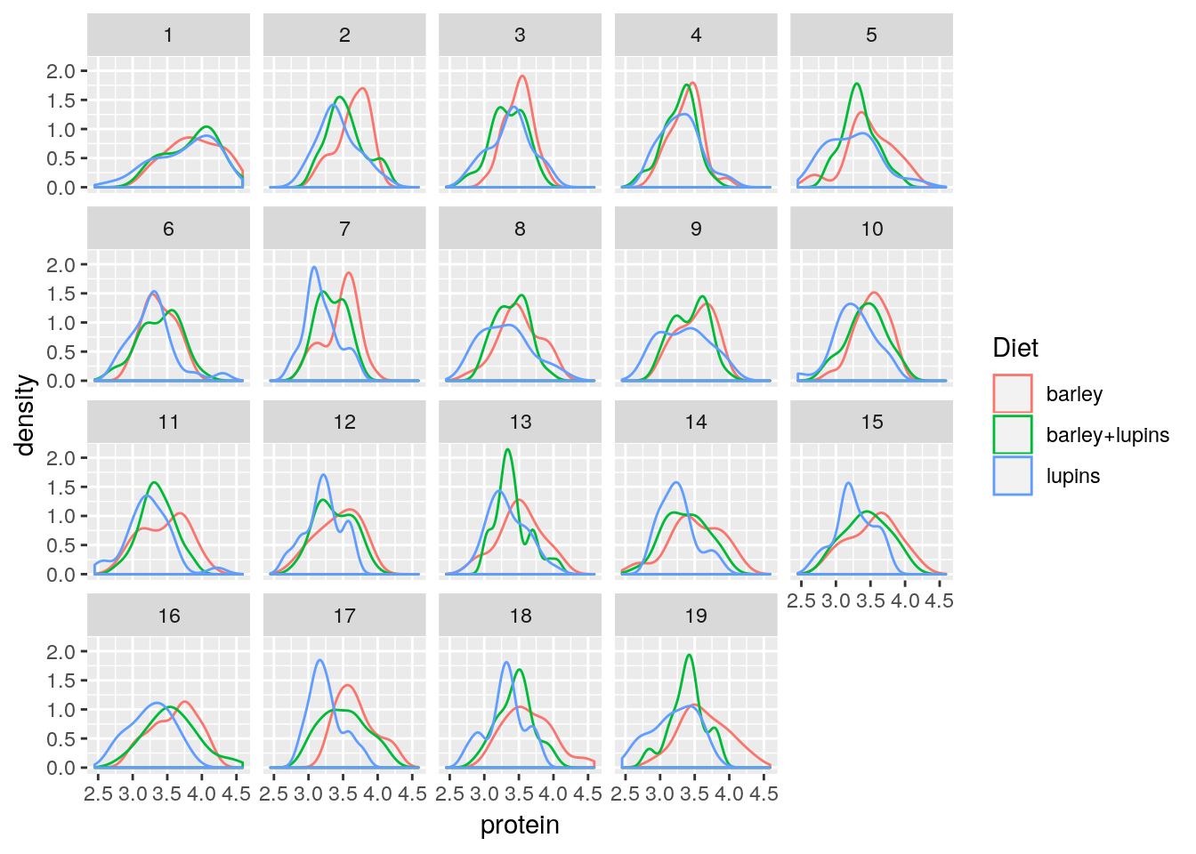
facet_grid forces the plot to appear allow rows or columns, using the ~ syntax.
ggplot(Milk, aes(x=Time, y=protein)) +
  geom_point() +
  facet_grid(Diet~.) # `.~Diet` to split along columns and not rows.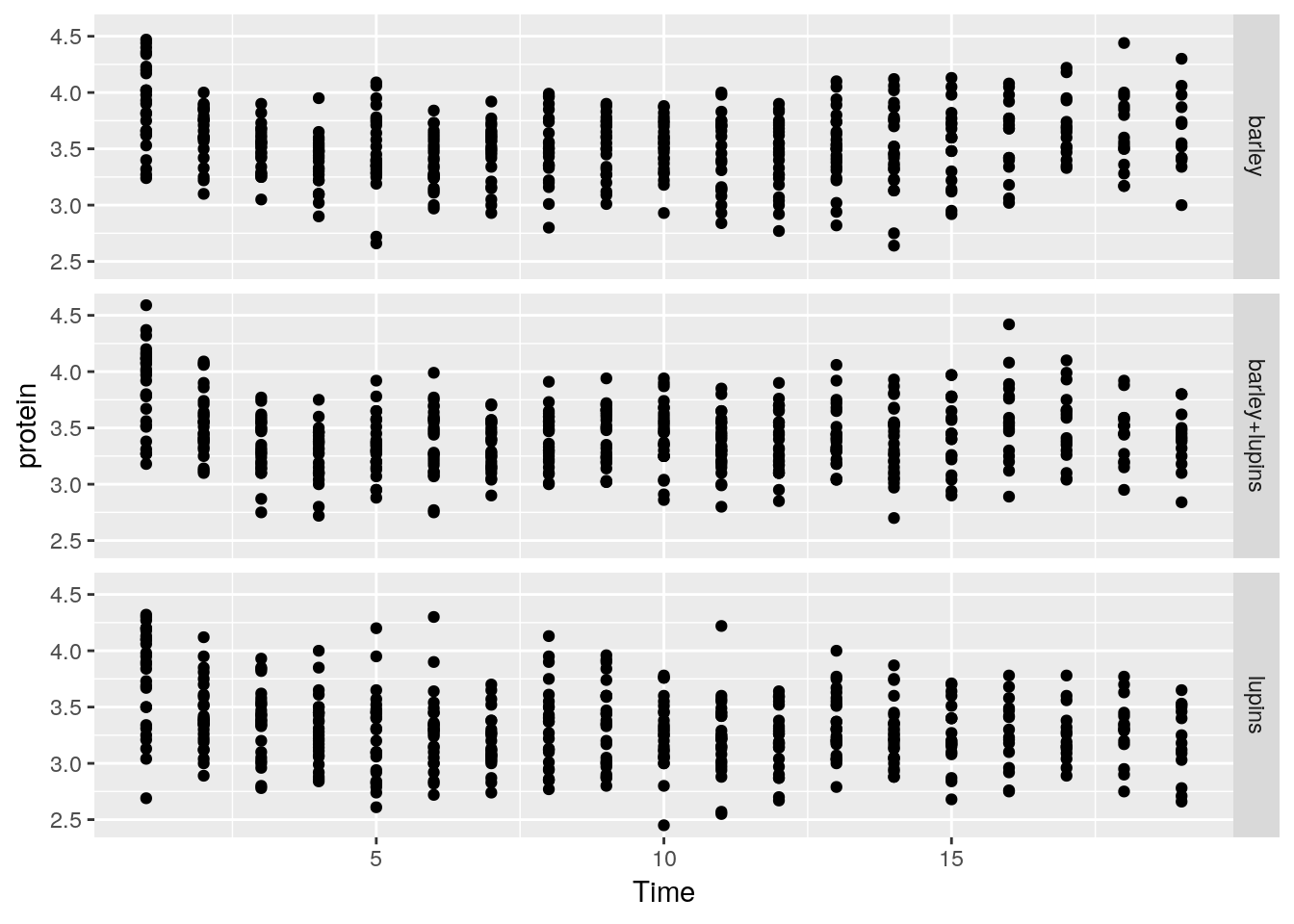
To control the looks of the plot, ggplot2 uses themes.
ggplot(Milk, aes(x=Time, y=protein)) +
  geom_point() +
  theme(panel.background=element_rect(fill="lightblue"))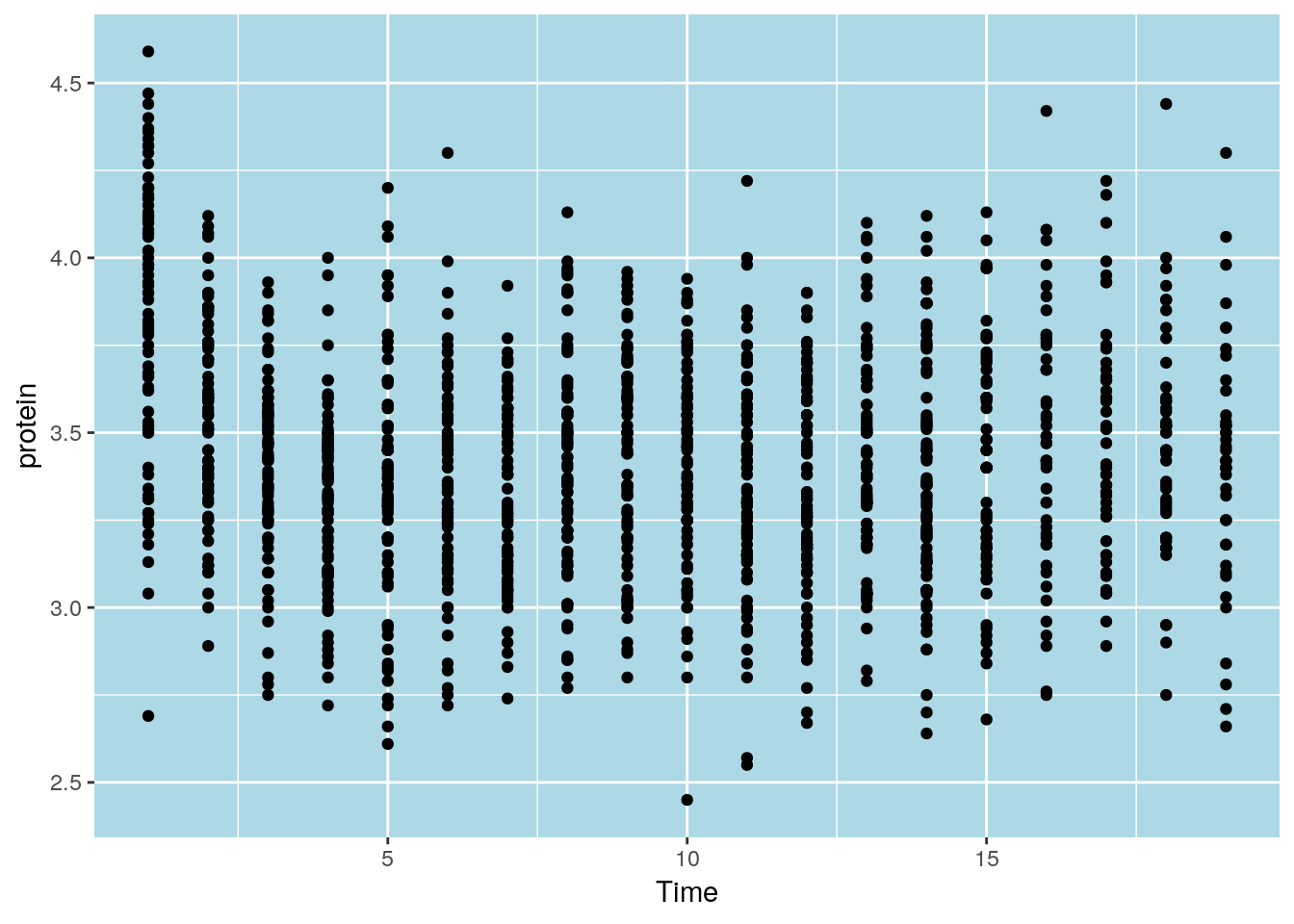
ggplot(Milk, aes(x=Time, y=protein)) +
  geom_point() +
  theme(panel.background=element_blank(),
        axis.title.x=element_blank())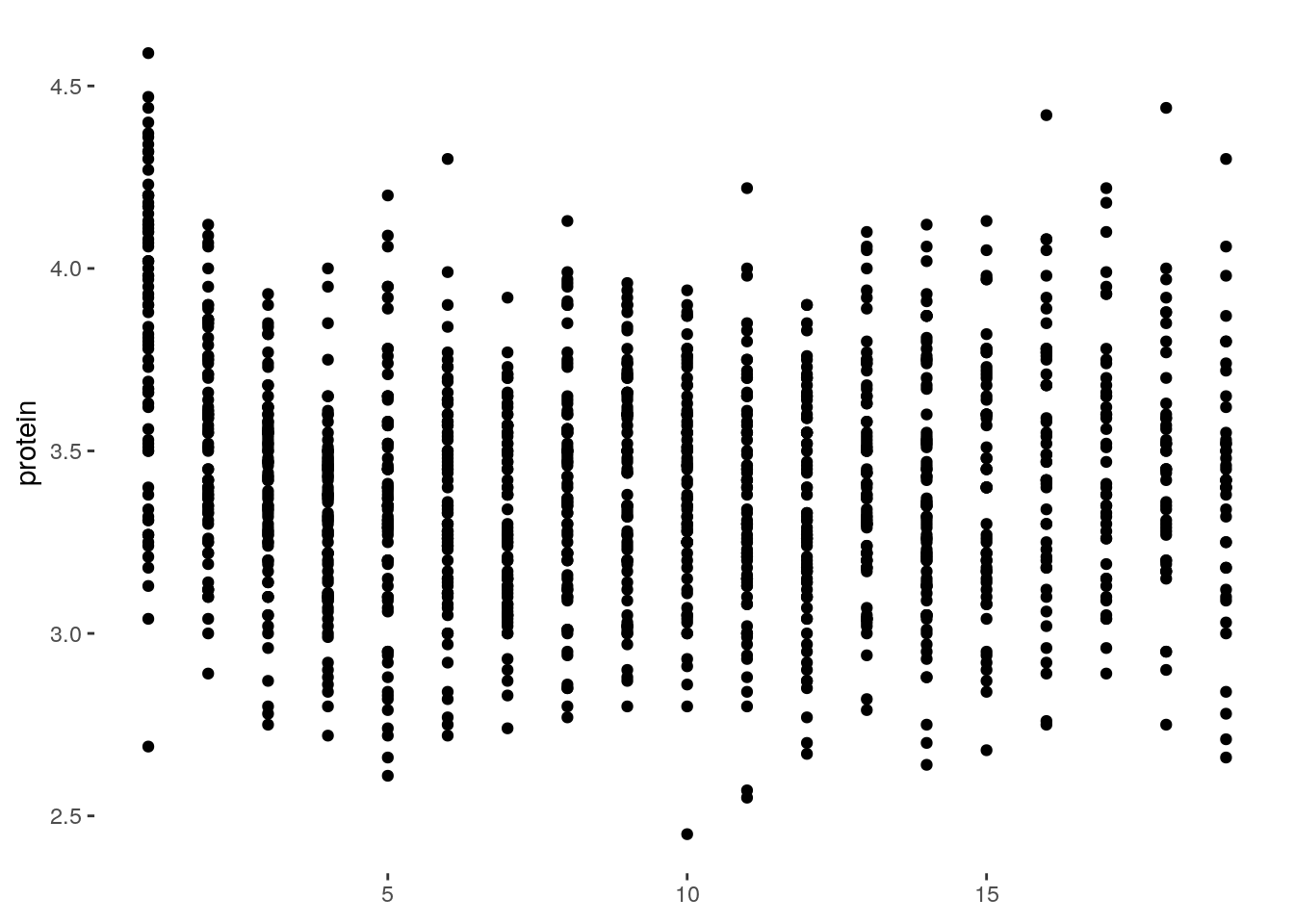
Saving plots can be done using ggplot2::ggsave, or with pdf like the graphics plots:
pdf(file = 'myplot.pdf')
print(tp) # You will need an explicit print command!
dev.off()cairo_pdf() instead of pdf().
Finally, what every user of ggplot2 constantly uses, is the (excellent!) online documentation at http://docs.ggplot2.org.
12.2.1 Extensions of the ggplot2 System
Because ggplot2 plots are R objects, they can be used for computations and altered. Many authors, have thus extended the basic ggplot2 functionality. A list of ggplot2 extensions is curated by Daniel Emaasit at http://www.ggplot2-exts.org. The RStudio team has its own list of recommended packages at RStartHere.
12.3 Interactive Graphics
As already mentioned, the recent and dramatic advancement in interactive visualization was made possible by the advances in web technologies, and the D3.JS JavaScript library in particular. This is because it allows developers to rely on existing libraries designed for web browsing, instead of re-implementing interactive visualizations. These libraries are more visually pleasing, and computationally efficient, than anything they could have developed themselves.
The htmlwidgets package does not provide visualization, but rather, it facilitates the creation of new interactive visualizations. This is because it handles all the technical details that are required to use R output within JavaScript visualization libraries.
For a list of interactive visualization tools that rely on htmlwidgets see their (amazing) gallery, and the RStartsHere page. In the following sections, we discuss a selected subset.
12.3.1 Plotly
You can create nice interactive graphs using plotly::plot_ly:
library(plotly)
set.seed(100)
d <- diamonds[sample(nrow(diamonds), 1000), ]plot_ly(data = d, x = ~carat, y = ~price, color = ~carat, size = ~carat, text = ~paste("Clarity: ", clarity))More conveniently, any ggplot2 graph can be made interactive using plotly::ggplotly:
p <- ggplot(data = d, aes(x = carat, y = price)) +
  geom_smooth(aes(colour = cut, fill = cut), method = 'loess') +
  facet_wrap(~ cut) # make ggplot
ggplotly(p) # from ggplot to plotly
How about exporting plotly objects?
Well, a plotly object is nothing more than a little web site: an HTML file.
When showing a plotly figure, RStudio merely servers you as a web browser.
You could, alternatively, export this HTML file to send your colleagues as an email attachment, or embed it in a web site.
To export these, use the plotly::export or the htmlwidgets::saveWidget functions.
For more on plotly see https://plot.ly/r/.
12.4 Other R Interfaces to JavaScript Plotting
Plotly is not the only interactive plotting framework in R that relies o JavaScript for interactivity. Here are some more interactive and beautiful charting libraries.
Highcharts, like Plotly [12.3.1], is a popular collection of JavaScript plotting libraries, with great emphasis on aesthetics. The package highcharter is an R wrapper for dispatching plots to highcharts. For a demo of the capabilities of Highcarts, see here.
Rbokeh is a R wrapper for the popular Bokeh JavaScript charting libraries.
trelliscope: for beautiful, interactive, plotting of small multiples; think of it as interactive faceting.
VegaWidget. An interfave to the Vega-lite plotting libraries.
12.5 Bibliographic Notes
For the graphics package, see R Core Team (2016). For ggplot2 see Wickham (2009). For the theory underlying ggplot2, i.e. the Grammar of Graphics, see Wilkinson (2006). A video by one of my heroes, Brian Caffo, discussing graphics vs. ggplot2.
12.6 Practice Yourself
Go to the Fancy Graphics Section 12.1.3. Try parsing the commands in your head.
Recall the
medianlogexample and replace themedianlogfunction with a harmonic mean.medianlog <- function(y) {median(log(y))} ggplot(Milk, aes(x=Time, y=protein)) + stat_summary(fun.y="medianlog", geom="line")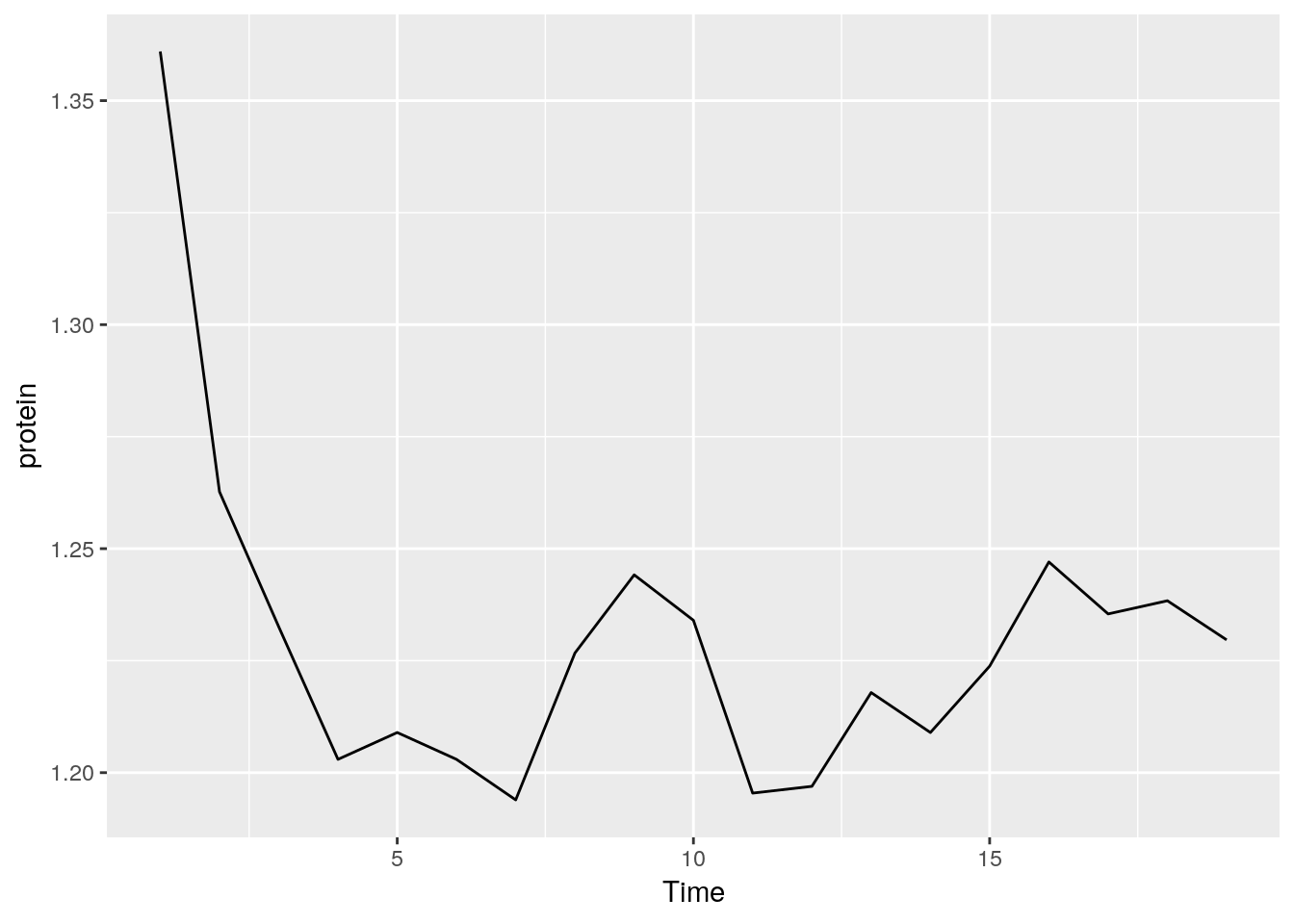 ```
```Write a function that creates a boxplot from scratch. See how I built a line graph in Section 12.1.3.
Export my plotly example using the RStudio interface and send it to yourself by email.
ggplot2:
- Read about the “oats” dataset using
? MASS::oats.- Inspect, visually, the dependency of the yield (Y) in the Varieties (V) and the Nitrogen treatment (N).
- Compute the mean and the standard error of the yield for every value of Varieties and Nitrogen treatment.
- Change the axis labels to be informative with
labsfunction and give a title to the plot withggtitlefunction.
- Read about the “mtcars” data set using
? mtcars.- Inspect, visually, the dependency of the Fuel consumption (mpg) in the weight (wt)
- Inspect, visually, the assumption that the Fuel consumption also depends on the number of cylinders.
- Is there an interaction between the number of cylinders to the weight (i.e. the slope of the regression line is different between the number of cylinders)? Use
geom_smooth.
See DataCamp’s Data Visualization with ggplot2 for more self practice.
References
R Core Team. 2016. R: A Language and Environment for Statistical Computing. Vienna, Austria: R Foundation for Statistical Computing. https://www.R-project.org/.
Sarkar, Deepayan. 2008. Lattice: Multivariate Data Visualization with R. New York: Springer. http://lmdvr.r-forge.r-project.org.
Wickham, Hadley. 2009. Ggplot2: Elegant Graphics for Data Analysis. Springer-Verlag New York. http://ggplot2.org.
Wilkinson, Leland. 2006. The Grammar of Graphics. Springer Science & Business Media.